How to View Your In-App Analytics
Last Updated: Feb 14, 2018 12:32PM PST
New year, new analytics overhaul!
With the advancements in our PWA product, we have overhauled our Analytics offerings. We also added more detail to the data to help your business better understand how your app is performing and to drive its growth. Let’s dive in!
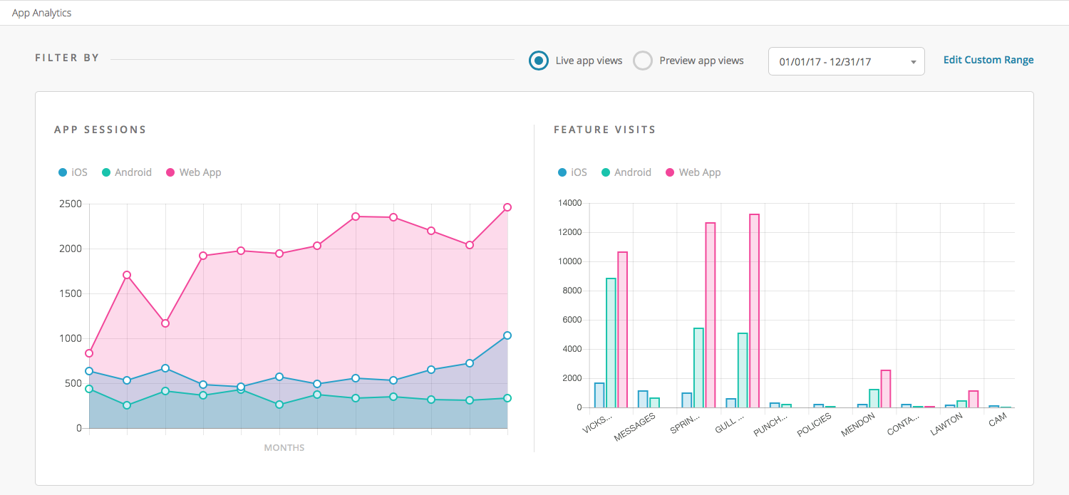
At the top, you will find your filters. These are straightforward, you have the option to show just the live app views so you can filter out the preview app, or you can show the preview app data if this is a demo account as a sales tool. There, of course, are the date selections including a custom range option. These filters will apply to the entire analytics page content.
Next up you see the App Sessions and Feature Visit.
App Sessions:
This section will show you how many sessions (each time your app is opened and interacted with). You can hover over each point to see an exact date and number of sessions for that platform.
Feature Visits:
Here you will find sessions per feature. If you have many features in your application, this chart will scroll sideways to display all of your features. Keep in mind you can hover your cursor over each bar to get exact numbers.
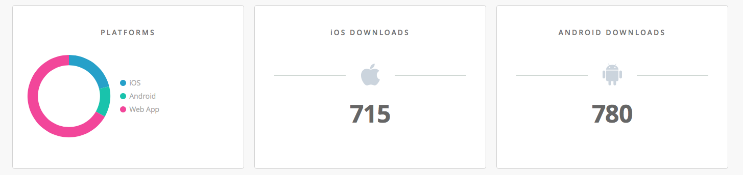
The next row of modules is Platforms and Downloads.
Platforms:
This section will show a percentage breakdown of the platforms your app sessions are coming from. Essentially this shows the percentage of sessions that are done on iOS, Android or PWA for any given time period.
Downloads:
As we cannot see exact download data that iTunes Connect and Google Play can provide, our downloads number is a ‘first launch’ metric. This means that if a user installs your app from the store but does not open it we cannot see it yet. Also, if a user downloads the app, launches it, then later deletes the app and repeats it will count as two first launches. To see the most accurate data here checking your App Store analytics will always be the most accurate.
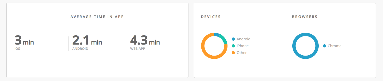
The next row of modules displayed Average Times and more details about devices.
Average Time In App:
Pretty self-explanatory, this module displays the average time your users are spending inside your apps per session. We recommend researching some industry data here as these numbers can vary depending on the purpose of your application.
Devices:
This data point is mostly for the Progressive Web App account. Here you can see what type of devices your customers are using and an overall percentage breakdown of those devices. Whether its an iPad, Windows PC, Android or MacBook we will show the breakdown here. For any of the lesser used products (blackberry anyone?), we will bucket under ‘unknown’
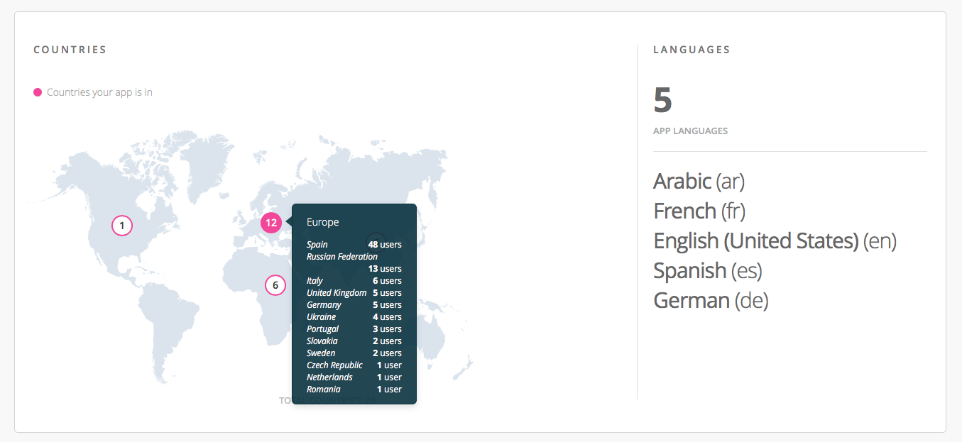
The final module is Global Impact.
Countries:
Here you can find a breakdown of all of the countries your users are accessing your app from. Hover over the numbers to see the country breakdown inside each continent.
Languages:
This shows the language settings your users’ devices are set to. Per the example below, during this time frame, there were users launching the app with all five of these language settings.